Hello, well done and thank you, dear Reader. Welcome to your very own cut-out-and-keep guide to English domestic architecture.
Well, sort of.
Rather, perhaps, a tour of the humid, sordid joys of suburban housing. You, smart, sexy Reader, will certainly recognise that the spectrum of styles covered below is likely to surround you. A ubiquity of limited proliferation. In order to demonstrate that these building types can be found pretty much anywhere, and not necessarily out of laziness, I have limited the exploration below to the corridor between East Croydon station and West Wickham, known with good cheer as the A232.
Empire
Our first era together. I shall be gentle and yet thorough, my soft, diaphanous Reader.
I'm using the term Empire to cover off a large swathe of Victorian and Edwardian architecture. Empire was when England was Great. Has anyone ever described themselves as Great British?
In this particular instance, the area to the north-east of East Croydon station is largely Empire, presumably knocked-up to cater for the burgeoning middle-class clerks (sort of ur-yuppies) drawn to the area by the fast rail links to London Bridge and Victoria (the latter opening in the 1860s).
The above view is entirely typical. Bay windows - some single storey, some double - with mullions decorated to look like Grecian columns. Completely not-in-keeping, the bays often evoke a castle's turrets. Clearly, laudanum was freely available to all commuters (a sort of ur-Starbucks).
This late-period fantasy is wonderful and bonkers in absolutely equal measure. A large lovely pile of large lovely nonsense, all hanging tiles and big windows, topped with terracotta gargoyles and, superbly, sporting a full-on fairytale tower. Let it never be said that our forebears were overly restrained or uncomfortably buttoned-up. This is a vulgar as vulgar can be, without perhaps the addition of some bass-relief of priapic nudity, or a tasty 400-point imprecation gouged into the walls.
An Englishman's home is his castle, hence the moat (garden), barbican and drawbridge (porch and path to the front door) and turret (turret).
Arts and Crafts and thence Tudorbethan

Proper Arts and Crafts stuff here. It's in part a rejection of the mass-produced nature of Victorian industry (in both senses), a return to a simpler, twee-er time. There's a lower, more cottagey feel, with somewhat-laboured the impression of craftsmanship in the twiddly details (look at those chimneys twist into the sky!). It's precisely the same impetus as that which fuels the current trend for Farmers' Markets: now that one can acquire a bewildering range of world goods from any given ringroad Omnimarket, the middle-classes are drawn towards new ways of displaying their wealth and excellent taste by buying purportedly traditional English things. Such as £8 quiches, drizzled with a tasty jus of organic, rustic, artisanal, seasonal, unpasturised, single-varietal, hand-made, sour-dough, free-range, locally-sourced, rare-breed epithets. It's a way of inventing a history, of faking old-money - of pretending to be of landed stock (or, at least, an honest farm owner). And this is terribly important to the Englishman or lady.
A later exercise in the same very-English pretence. A sizeable and immacuately-maintained bit of Tudorbethan, with crown green-perfect lawns and an in-keeping garage. It's even got a wishing well (!) in the curiously-generous front garden.
The style was also applied, somewhat surreally, to parades of shops. Here we have Ye Olde Wimpy (est 1928) on Wickham High Street.
Moderne (-ish)
There's not a lot of Moderne along this route. Perhaps this suburban setup of Zone 5 appealed more to larger families, who preferred the more traditional stylings of Tudorbethan built at much the same time. But here is an example of a building, four single-floor maisonettes by the look of things, with a nod towards fashionable Moderne. The original central windows would have been sexy curved sun-trap windows (sadly now angular UPVC), with horizontal glazing bars and just a few vertical member. The clean white horizontal band is a sort of go-faster stripe to pair with the streamlined windows. But, other than those, it's a largely conventional building with hipped roof and unrendered brick. A safe version of the future, still recognisably English.
Episode IV: A New Hope
The aftermath of the war gave architects the opportunity to try new things. Or, rather, it gave them time to think about what new things they'd want to build once the post-war building regulations were relaxed. Once they were, in 1954, we were treated to an optimistic compromise - a new way of living, but on the cheap (cf the valiant efforts of all the New Towns to build a new world on a budget).
This is a rather pleasant little block. Notice that the weight is not being taken by the road-facing walls. This 'free elevation' means you can do what you want with the outside: in this instance, have windows that run along the entire front and side of the building, including that rather sexy unsupported corner. There doesn't seem to be a chimney stack either, suggesting that the building came with some sort of space-age heating system, like an asbestos-lined CFC-burner, emitting infra-red heat and ionising radiation in equal measure.
Further rule-breaking. The jaunty roof-line emphasises the buzz-saw frontage that affords each shop a few more square-footage of glass in which to display its wares. Groovy.
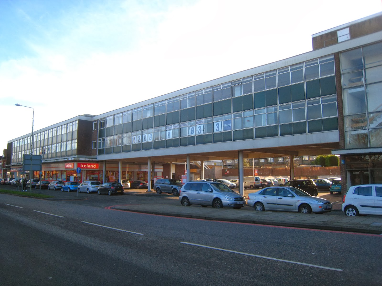
Another demonstration of what was once state-of-the-art engineering. Building-width strips of windows and huge panes of glass in the stairwells allow as much light in as the English climate permits us. It looks like the office space at the top is deserted. Frankly, I'm still impressed that the whole central section of that block can be supported on so few slim columns. Note, however, that these buildings are deeply unfashionable and can therefore only attract cheapy tenants, like Iceland and The Original Factory Shop - compare with mummy-friendly M&S, which likes to take up new-builds (see below
) or fashionably stylish buildings like Art Deco ex-cinemas.
Comforting stodge: vernacular (and PoMo)
Oh dear. After all that scary optimism, we slid back into making things look a bit like old things. Here're some retirement flats in the style of a row of thatched cottages. Small windows, and an upstairs you can't stand up in properly. Genius.
This, however, rather superbly bridges the gap between fashionable retro and 80s fashions - the blue-frame square-pane glazing to the left meets an Olde timber-clad gable (enlivened by the jazzy yellow chevron announcing the then-exciting thrill of Sunday opening).
The ground floor of this Sainsbury's also emulates the roof line of thatched cottages, but tops it with some dead-eyed nuclear bunker / gun-slit combo. Happy shopping, comrades.
Part of PoMo's schtick was re-introducing Classical forms after all that New Hope stuff. These mock-Georgian terraces (we're back to vertical windows again) are decorated with wire-frame triumphal arches for some reason. Perhaps you can grow strawberries up them. The top gable window sort-of describes a split pediment. Japes.
I think this is much newer, but the mindset is the same. A freakishly overgrown corner tower (topped with a rustic weather-vane) in a Venetian style (why not?), with an adjunct archway in render. But this is of course quite consistent with English architecture - it's more important that the building borrows old forms, than that they necessarily make any sense together.
My argumentation here, which is essentially a unifying philosophy for much of English domestic architecture, has limits. Take a look at the pair of terraces below. On the left is a row of bargain-basement Victorian houses. They are of meagre proportions, and come with just a pair of simple windows (no light-gathering bay windows here) and not even a single terracotta gargoyle. The front garden is just a slither of space, keeping the passing pedestrian literally at arm's length.
Demonstrating face-hurting stupidity, the designer of the new-builds to the right chose to clone these impoverished hundred-year-old originals, despite the old ones being of zero architectural merit. Even then, the clones' windows are somehow even pokier. This is the sort of lazy crap that makes me want to dismember the architects' pets (and possibly those of the current residents, as a warning to those who support the market for this retrophiliac cack).
There is now at least somewhere to put the bins. Hoorah for progress.
After Post-Modernism
What's not to like here? Perhaps a roof-line to induce sea-sickness, the already-faded wood cladding, and the grimy porridge-beige render. And such sophisticated details as the high-visibility guttering downpipies (see how it crunches awkwardly over the corner of that twee porch). And nowhere to put the bins other than the front garden. And the tartrazine-orange front doors. Oh, and the bloody coaching lamps. Come, friendly bombs and fall on the A232.
And, of course, after Post-Modernism comes good old-fashioned Modernism. Here, M&S pretends to be in 1920s Germany.
Whimsy
What is more English than daft, aspirational excess? Here, a tiny bungalow with full-on pedimented arch. And net curtains. And partially off-street parking. Win.